
BruinFam
UX / UI Design for a UCLA mobile application
Scroll down to view the project

Design Brief
A new school year is approaching and the orientation team is looking to you for some design expertise. Design an experience for new students to browse, search, and propose new student organizations. Provide your overall process, a wireframe flow, and one to two screens at higher fidelity.
Introduction
The University of California, Los Angeles enrolls about 31,000 undergraduate and 13,000 graduate students. The diversity of the student body is enormous and so is the range in personal interests. It’s no surprise that UCLA is home to more than 1,000 clubs and student organizations. As it stands, there is no up-to-date, centralized platform for students to effectively navigate this student organization overload. I wanted to solve this problem with a new application: BruinFam.
Research
Research Part 1: Brainstorming


I began brainstorming some of my own ideas about what was wrong with how students were currently finding student organizations and what could be done to improve the situation. I took some notes down on paper as I thought through the prompt.
Research Part 2: Competitor Research and Survey
I wanted to know more about how students are currently finding student organizations to join and what this process is like for them. Through the responses gathered from a survey of UCLA students, I found that these were the top three methods:
.png)
1. Student Activities Fair
At the beginning of the school year, UCLA hosts a large outdoor orientation fair where students can peruse all of the student organizations, each at their own individual booth.
“It was really confusing trying to figure out what clubs were there and where they were if I was trying to find specific ones.”
“A bit hard to find "similar" groups, seemed like they were somewhat randomly dispersed.”
2. Social Media ( Facebook, Twitter, Instagram, etc)
Some student organizations have strong social media presence while others do not. Different organizations also vary in which platform they use primarily.
“I found out about the club through an invite to a Facebook event, but when I tried looking for similar UCLA clubs through Facebook, I couldn’t find any.”
3. Friend Recommendation
Student organizations rely on word of mouth to bring in new members and students rely on their friends to recommend good student organizations to join.
“ I wanted to join that sorority because my friend said that her new sorority sisters were like her second family.”
Understanding the Challenge
.png)
Extra-curricular activities are a core part of the college experience and student organizations offer a great way for new students to get involved with the university community. However, the process by which students discover, learn about, and join a student organization is riddled with issues leading to low participation and interest; over a third of students that I surveyed are not involved in any student organization. I want to make it easier for students to find organizations that fit their needs. So why are UCLA students not joining student organizations? In my research, I found that the problem came from a variety of factors:
The sheer number of student organizations is overwhelming to students. Without an easy way to sort through all the choices, students find it too difficult to find an interesting choice amongst irrelevant options.
“The massive number of clubs is overwhelming, discouraging you from taking the time to look at everything.”
Students find it difficult to coordinate their busy schedules with student org schedules.
“I want to know the schedules for clubs so I can plan ahead. But they’re not always available so I end up not going.”
Students have difficulty communicating with student organizations.
Making personal connections to existing members of student organizations doesn’t
come easily to everybody.
“Organizations never got back to me even after I signed up, I felt like they forgot about contacting me.”
“Sometimes I get nervous when talking to club officers of a organization that I’m interested in. I can get pretty intimidated.”
Solving the Problem - My Mission Statement
After taking time to understand the problem, I set out to create an application that addressed the issues at hand. Based on the pain points that I identified, I knew that I wanted my design to meet the following goals:
1. The design should be a centralized platform for all student organizations that can be filtered effectively based on topic/interest, allowing users to quickly and easily find orgs that match their personal interests.
2. The design should help users keep track of school organization schedules and make information concerning time commitment, scheduling, and recruitment cycles readily available to users.
3. The design should encourage communication between students and student organizations and allow students to connect with existing members.
I used these three goals to direct my process as I went on to design the application.
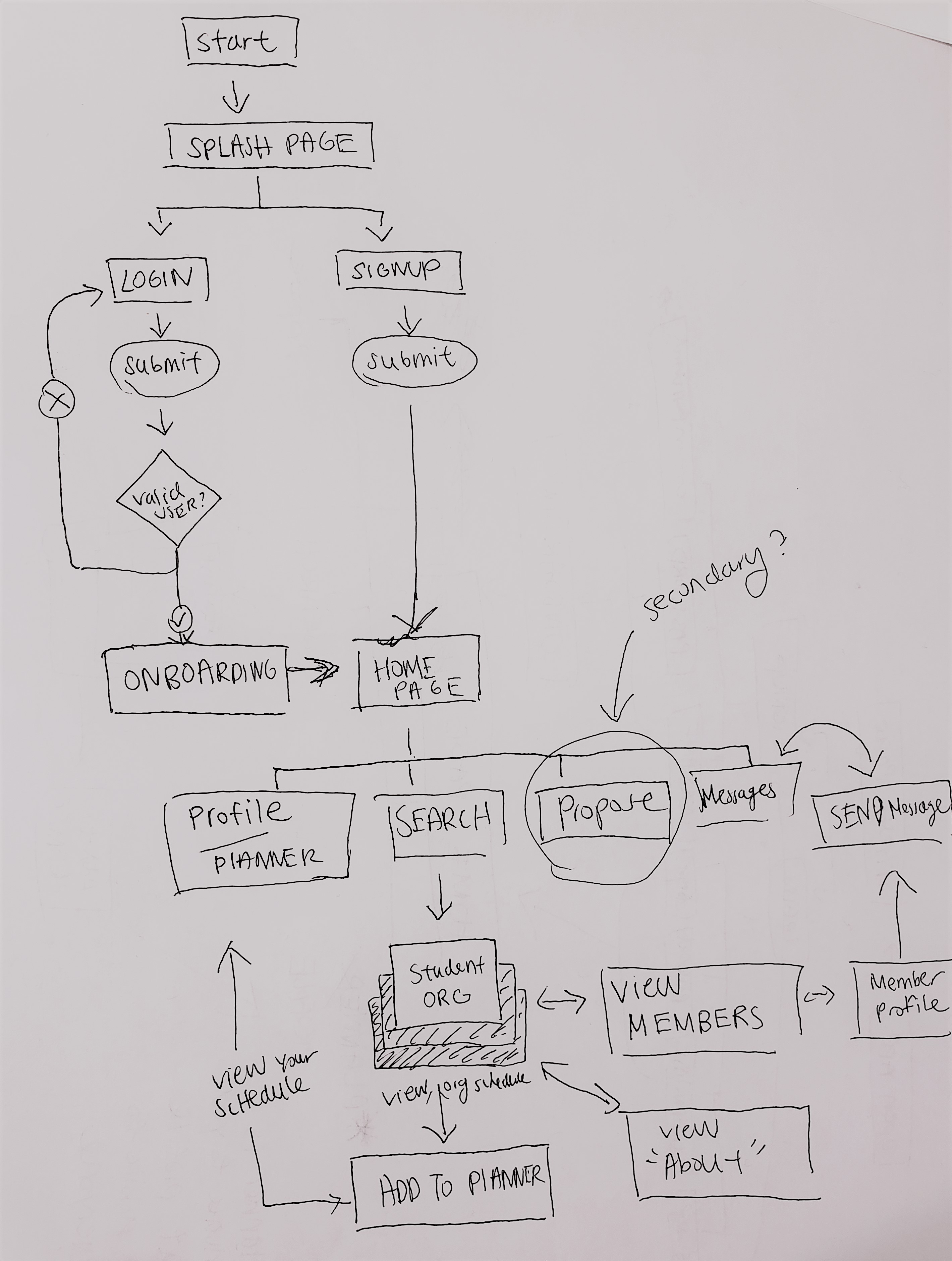
User Flowchart
I started my design by first mapping out the paths a user might take while using the app. From starting up the app, to completing the onboarding process, to searching through student orgs, to planning a schedule, I sought to design a flow that minimized the number of steps a user would have to take complete the task of finding an organization they would want to join. I first drew a few pen and paper iterations of the user flow and then moved on to creating a finalized digital version.

Wireframes
I began creating the wireframes by drawing some pen and paper sketches. At this point, I had a general idea of what screens I needed to design and how they linked to each other. Sketching helped me imagine possible layouts for these screens. This is the part of my design process where form meets function; I knew how my design should behave so I had to create visuals that aligned with and supported this behavior. I chose to focus on designing wires for the parts of the app that I felt were most specific to the task at hand. This meant foregoing designs for messaging, login/signup, and app settings, which I thought would follow the typical design conventions of many other apps.


Onboarding

Through the onboarding screens, I wanted to clearly communicate to the user the purpose of the app in order to help them understand why the app would be useful to them. I referred back to the goals of my mission statement and created one screen to communicate each of the three goals. Again, these goals were:
1. Find an organization that aligns with the user’s interests
2. Help the user plan their schedule
3. Facilitate communication and encourage connections
Navigation
The bottom navigation menu allows the user to view four different states:
1. Dashboard/Home
2. Search
3. Messages
4. Profile
These four options were placed from left to right in this order. I organized the menu such that the options go from the least to the most specific / personal. For example, the dashboard is used to browse a large range of organizations. Search is used when the user has a more specific topic in mind. The message option is used to make personal, one-on- one connections with others. Lastly, profile houses the user’s personal saved interests and their personal schedule and event planner.
Home

The home page displays recommended student organizations, events, and categories/tags, giving the users several avenues for exploring student organizations they otherwise would not have known about. I chose to design a system for users to directly message student organizations by placing message icons along with each featured student organization. This was meant to encourage users to connect with orgs by making contact very accessible.
Student Organization Page

The student organization screen displays the organization name, description, upcoming events, schedule, and notable members. I wanted this page to give the user a good understanding of who an organization is, what they do, and when they meet. The “View schedule” option at the top of the page gives the user an overview of the organization’s event calendar and allows them to add these events to their personal planner. Similarly, the “Add to planner” option displayed along with the “Upcoming events” gives users a quick and easy way to plan to attend an event by adding the event to their planner.
The “Meet our Members” section of the page is a place for users to view short personal reviews of the student organization and to directly connect with members.
Search

My top priority in designing the search screens was to give users a way to filter and sort options effectively. I gave special attention to thinking of all the different ways a user might want to filter through organizations. This included application fee prices, organization size, time commitment, etc.
High Fidelity Screens


These are two examples of high fidelity screens based on the wireframes that I had created. Because I had designed this app to be used by the UCLA community, I thought it would be appropriate to create a visual design that aligned with the UCLA brand. This meant keeping the classic UCLA blue and gold as the main colors of the app.
Stretch Goal
My future goals for this project include integration with Google calendar and myUCLA class planner. Students already use both of these planners to keep track of their daily events so it would make sense to include both of these in BruinFam.